
Blog posts
Chapter 31: Making story art with the GIMP
Previous Chapter Next ChapterI used to commission story art, but this year, I've put together most of my art myself using the GIMP (GNU Image Manipulation Program), though I can't draw at all.
GIMP is photo editing software, very much like Photoshop, available free at www.gimp.org. This is not a GIMP tutorial, just a demonstration of how I've used GIMP for cover art. GIMP lets me combine and modify existing art. Ponies are easy to manipulate in GIMP because they're vector art, so colors are non-textured and stay the same over large areas. Trying to modify things with photo-realistic shading is much harder.
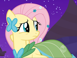
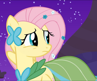
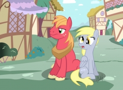
The simplest use of GIMP is to crop pictures and erase unwanted details. I use Microsoft Paint for cropping, but GIMP is better for erasing. I erased the Hub logo in this picture today for my upcoming story "Pony Play":
To do this, just play a video, stop on the frame that you want, use screen (active window) capture, and (in Windows) paste it into Microsoft Paint. Crop it some—not quite as closely as you want; leave some extra edges in case you want them back later. (In the GIMP, unlike in Microsoft Paint, you can clip things out of the canvas without deleting them from the layer they are on.) Then save it as a .PNG file (not a JPG; I think that removes more details), and open that PNG with GIMP.
(If anyone knows a good video player that lets you single-step through frames, please tell me.)
Then, select the brush tool. With vector art, you usually set both brush "hardness" and "opacity" to 100%. With curved lines, you're going to work with the circular brush. (The other brushes are rarely helpful. There is no square brush; for fine squarish detail, you'll have to take the circular brush down to 2 to 4 pixels.) To erase, right-click somewhere very near the thing you want to erase, which sucks up the background color from that spot. Then push the left mouse button down and hold it while you rub that color over the hub logo. Release and then hold the button down again periodically; this pushes what you've done so far onto the undo stack, so if you wipe something important out, you only lose the last erase stroke made when you undo.
To do more than this, give yourself a half a day to work through some tutorials. Or open a photo in GIMP and start playing around. As with Photoshop, the key things to understand are layers and selections. Your work will be divided into different layers, with objects on transparent backgrounds on the upper layers, shading and lighting on the middle layers, and backgrounds on the bottom layer. Your selection is a two dimensional boundary on all the layers, usually outlined with a dotted white line. Any time you use a tool, it will draw (or erase, magnify, or whatever) only in the intersection of the layer you have selected, and your selection area.
Layers, layers, layers. Use lots of them. A picture with 3 objects can easily have a dozen layers, for background, atmospheric shading, shadows, and invisible copies you made before rotating or stretching things so you can go back to them if you change your mind.
I assembled this cover art for "Big Mac Reads Something Purple" by clipping, scaling, rotating, and transforming separate pictures of the library, a desk, a book, the Cutie Mark Crusaders, and an image of Big Mac clipped out of the cover art I commissioned from blackm3sh for "A Carrot for Miss Fluttershy":
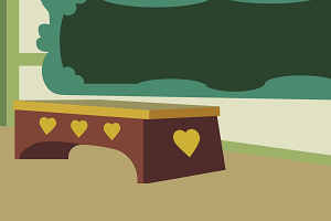
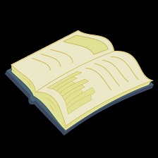
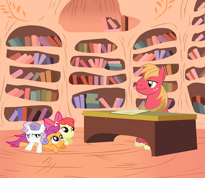
Notice I reshaped the desk, removed the hearts (as described above for the Hub logo), and used the rotation tool to rotate the book to be flat on the desk, and the brush to give Big Mac a slight frown. I should have added shadows under the desk.
For this, I had to do clipping, a common operation. First, choose the layer with the object to clip, and execute "Layer->Transparency->Add Alpha Channel". After doing this, deleting things removes them from the layer, instead of just painting them white. Then select & delete everything but the object you want from that layer. There are some fancy auto selection tools that try to let you automatically select areas by color or border, but they don't usually work well. I just zoom in very close on the object I want to clip, then use the "Free Select Tool" to draw a line around its boundary, select the areas around the object, and delete them. Don't try to be exact; you're probably working on an image 1000-2000 pixels wide, and it's going to be downsized to 250 pixels wide for fanfiction cover art. (EqD cover art can be about 800 pixels wide, so be more careful with that.) Don't try to delete everything all at once; you may end up spending 20 minutes tracing a detailed contour, and then losing everything because you accidentally clicked once in the wrong place. GIMP has multiple-level undo to undo any deletes, but it does not have any way to recover a contour selection if you accidentally close it. So delete one piece at a time.
For "Behind the Scenes", I clipped out a picture of human hands holding a clapper board, pasted it into its own layer, and used the text tool to write a different title onto a layer above the clapper board. (The image is scaled down too far for you to tell, but it says, "Celestia Does Equestria.")
For "Mortality Report", I started with this clip from the show of Celestia writing on a scroll. Nice, but a little too cheerful to be writing about Twilight's death.
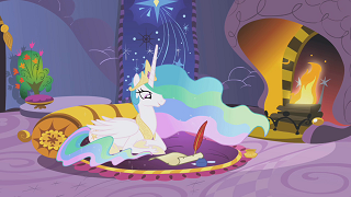
So I erased the original eyes, clipped the sad eyes out of this picture,
pasted them into a layer, stretched and rotated them, and used the brush to redraw her smile as a frown:
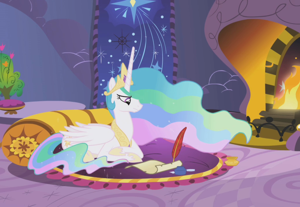
(Unfortunately, the frown is almost completely invisible on the fimfiction image.)
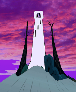
For "Long Distance", I drew a crappy white tower as a set of rectangles, clipped off some corners, made four copies of a window/door object for the opening at the top and the arrow slits, pasted Twilight into the top of it, cut & pasted some trees and bushes from screenshots in front, clipped some clouds from a photo & added color to them with a gradient filter, and to the background with another gradient filter:
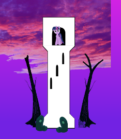
Then I merged Twilight, tower, windows, trees, and bushes into a single layer (using Merge Down), and stretched it all using the Perspective tool, and added cliffs from a screenshot underneath. (You can tell I added the cliffs separately, because the perspectives on tower and cliff don't quite match. They were already in perspective in the screenshot. Tower and cliffs could also use some shading or reflected light. Dammit, now I see it isn't quite vertical, either.)
I showed in a blog post the three images I combined in GIMP to make my avatar. Notice the top hat is stretched and rotated. More subtly, I darkened the area immediately under the top hat to be in shadow. I just added a layer and drew a partly-transparent dark shape on it. It's small but makes a big difference. Even more subtly, I dodge/burn/blurred the ears where they meet the hat in the right photo. Borders between things taken from different photos often don't look right without some touch-up. I used alternate Dodge & Burn on the mouth, just around the end of the cigarette, to make it look like the lips are bunched up around the cigarette, holding it.
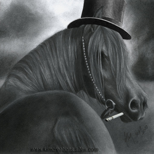
Left: Without shading. Right: Shadow added under hat.
Light and shade is easy to get wrong when you're pasting together things from different pictures. The Dodge/Burn tool is your best friend for shading. I make a separate layer for shading, so I still have the original objects in the GIMP .xcf file if I decide to put things together differently. Focus is also tricky. If a background object is in sharper focus than the foreground, blur it. The cigarette here might ought to be blurred.
For "Burning Man Brony", I combined a picture of myself at Burning Man with a frightening drawing of Discord by Noben.
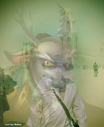
The original artwork had lettering over Discord's horns, and I had to erase it and draw in the missing pieces, which took a long time, as I can't draw. Fortunately they're at the very top, mostly transparent, so you can't see that they are not quite right. I made two copy layers of Discord, and clipped the dark background out of one, so that I could get his head less transparent than the background. There are also two copies of the photograph, one as the background, and the other partly transparent. For both the transparencies of the photograph and of Discord, I used a radial gradient filter, to make my face more transparent and Discord's more opaque as you move towards the center. I added another layer of transparency for Discord's horns, which otherwise disappeared in the gradient. To use a gradient filter, do this:
1. Right click on the layer to fade in the Layers window & select "Add Layer Mask". Click Add, checking default "full opacity" is selected.
2. Select Blend/Gradient tool. Set gradient to "FG to BG". Set shape to "Radial" (in this case). With the gradient tool, you draw a line, and a color gradient is made along it. With radial gradient, the first click will be the center of a gradient circle. Draw a line from the center out to one edge of the circle. "FG to BG" vs. "BG to FG" detemines whether it fades out or in as you move outward.
3. Right-click on the layer and "Apply Layer Mask".
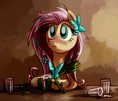
For "Fluttershy's Night Out", I used the paint tools to remake the wonderful "Bitter Alcoholic Fluttershy" by White Diamond into an apprehensive, tense Fluttershy:
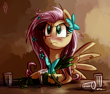
This took an entire day (probably longer than it would take a real artist to do an entire picture). I had to erase many different parts of the picture and fill in the background (for instance, the wall behind the wings, which I matched to the existing walls using blur and diffusion filters), completely redo the eyes, and redraw the shadows on the new right forehoof (mostly using the smudge and dodge/burn tools). I erased the WD because White Diamond hates this picture, as she feels the posture and neck extension is wrong (it is). And the right forehoof is the wrong size and shape somehow, though I redrew it three times. She kindly allowed me to use it anyway. It shows how much someone who can't draw a bit can do with the GIMP and a lot of patience.
(I started modifying the picture to show WD what I was aiming for and see if I could commission her to modify it. She didn't have time, but you can use GIMP to outline ideas for a commission.)
There are three things you'll find puzzling about GIMP. One is trying to draw and not seeing any change on the picture where you expect it. This usually happens because you're looking at a layer other than the one that is selected, or because you're trying to draw outside the selection area.
The second puzzling thing is that when you use a transformation tool, such as to copy or rotate something in one layer, it often removes that object from the layer its in and puts it in a "floating selection", which is a useless thing that will trick you into losing your work unless you right-click on that floating selection immediately and click on "To New Layer", turning it into a layer. As far as I can tell there is never any reason not to do this immediately. Notice that the thing you have operated on is usually now missing from its original layer, so you should copy a layer before using any transformation tool on it. In many cases, you will then delete the layer you modified, as it will no longer contain anything visible.
The third puzzling thing is that different tools behave differently. Some of them operate directly on a layer, and some of them produce their results in floating selections. Each tool is a plug-in to the software, and can behave pretty much any way that it wants to. Some of them, like the cage transformation tool, are completely their own thing. Just learn each tool separately.
Avoid merging layers together unless you have to. Try to keep all your original objects as separate layers. They don't have to be visible; you can just keep them in the file so you know where to find them if you want to reuse those objects. Make copies of layers profligately. Much better to waste a few megabytes of disk space than to have to reconstruct art.
The last things to do with your file are to set the canvas borders, save it, scale the canvas down, and export it as a PNG or JPG. Set the canvas borders instead of cropping in case you want the stuff outside the borders back later. Save before scaling down. Never save the GIMP .xcf file after scaling it down, or you'll overwrite all your work except for the crappy lo-res version. Keep a backup just in case you accidentally save it after scaling down.
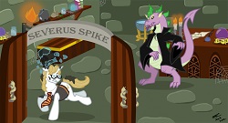
I always export to PNG or JPG at compression level 1. Default is 9, which sucks, and doesn't save much space. Compression level 0 makes files that are much larger than compression level 1, and look about the same. Fimfic cover art is always 250 pixels wide now. Try to make covers that are tall and narrow; you get extra screen space for free, up to 400 pixels tall. Making it wider than 250 pixels will just shrink it vertically. Plan ahead for the eventual 250 pixels wide. I knew the Twilight in my tower would be barely visible at that resolution, but that was the effect I wanted, because Long Distance is about her being too far away, feeling like she's receding into the distance. I didn't plan ahead with this picture I commissioned for "Severus Spike"; it had a lot of detail that was lost at 250 pixels wide.
On today's thumbnail front page, at 50 pixels wide, it would look like this:

You can't get a decent picture in 50 pixels, so just try to get something that has enough plain background area that it doesn't look like food stains. Think of the thumbnail and the story page version as two different pictures; make something that will work for both if you can.
It's surprisingly fun to make things with GIMP. Making stuff you can see is gratifying in a different way than writing. I think learning how to use it is worth it for that alone.
Next Chapter: Axe Cop Estimated time remaining: 5 Hours, 10 Minutes